
Introduction
Component libraries are a tool that have been around for nearly a decade in the frontend world, yet it is still not a tool widely adopted in many organisations.
Software engineers who work directly on the frontend have a better opportunity to understand – with nuance – the usefulness of component libraries in terms of longer-term productivity.
This article is an attempt to convince non-technical folk of the same. The comes with the belief that with more understanding, comes more willingness to bite the bullet, and see the use of component libraries as an investment, more than a cost.
The Enterprise Dilemma
The difficulty of seeing the value of component libraries is even larger in enterprise environments, which are typically rife with legacy systems. The effort it would take to implement component libraries in existing frontends can often feel like running on a treadmill – all that time and effort, only to end up back at the same spot!
Instead, teams wonder why they can’t simply continue working the way they do, and extend features rather than rework existing code.
This attitude is so prevalent that organisations that want to adopt component libraries typically have to resort to mandates in order to force adoption.
All this is a shame, because component libraries are some of the biggest productivity boosters for complex IT architectures, given their proliferation of systems. Let me explain why by drawing an analogy.
Our Analogy: Legalese
I’m going to pick legal for the analogy, because legalese scares the bonkers out of most people. Which is a similar effect that code has on those untrained in it, or traumatised by years of working in abusive coding environments (my condolences).
Let’s begin by looking at the following excerpt from a case between Jasper National Park applicants and the Attorney General of Canada:
This application for judicial review arises out of a decision (the Decision) announced on or about the 30th of June 1998 by the Minister of Canadian Heritage (the Minister) to close the Maligne River (the River) in Jasper National Park to all boating activity, beginning in 1999.
I’m not sure about you, but to me, it looks precise, clear, well-defined, and took way too long for my mind to process.
Now look at its corresponding summary, in plainer english:
Judicial review of Minister of Canadian Heritage’s decision to close Maligne River in Jasper National Park to all boating activity beginning in 1999 to protect habitat of harlequin ducks.
A bit clearer, but definitely lacking in precision. For example, some of the dates have been stripped out.
The question is, which would you as a non-lawyer rather read? Most likely the latter one, stripped of technical jargon.
The above came from a study examining the potential for machine learning to perform legal summaries. Legal summaries are provided by legal experts, to make it easier for lawyers closer to the courts to find case-related information for their own cases.
These summaries are essential in the legal field because of the vast amount of historical precedent to wade through when fighting a case. This is a function essential to legal systems heavily employing common law, like most Commonwealth derived courts.
Sure, lawyers could take lots of time to peruse and summarise each individual legal case, but why do that when they can free themselves up for more specialised work. This is they employ legal experts to summarise cases for them.
This is the same role component library authors play. They take a set of technologies, and package it into libraries that are contextualised and simpler to use. Then programmers closer to the end product can take the distilled concepts (encapsulated as a tool), and apply them to serve end users.
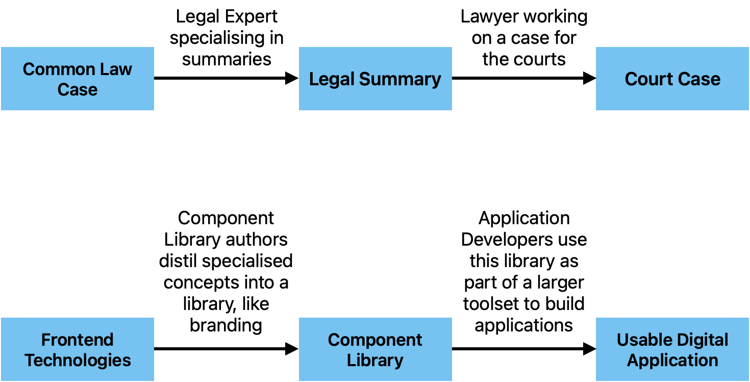
Notice how we have 2 legals in the above, the same way both “authors” and “devs” are programmers. One just sits closer to the technology (legal case) and the other closer to the user (court case).
A More Technical Example
Let’s look at a more technical example, by showing the code it takes to build something like the following mobile web page.
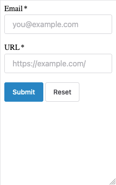
We’ll start with with code (markup actually, but I’ll call it code because that’s how it looks like to most non-programmers) that uses a component library.
This code is taken straight out of the examples of a popular component library called shoelace. I only added a few modifications to get it to work straight out of an html file.
<!DOCTYPE html>
<link rel="stylesheet" href="https://cdn.jsdelivr.net/npm/@shoelace-style/shoelace@2.15.0/cdn/themes/light.css" />
<script type="module" src="https://cdn.jsdelivr.net/npm/@shoelace-style/shoelace@2.15.0/cdn/shoelace-autoloader.js"></script>
<main>
  <form>
    <sl-input type="email" label="Email"
      placeholder="you@example.com" required>
    </sl-input>
    <br />
    <sl-input type="url" label="URL"
      placeholder="https://example.com/" required>
    </sl-input>
    <br />
    <sl-button type="submit" variant="primary">Submit</sl-button>
    <sl-button type="reset" variant="default">Reset</sl-button>
  </form>
</main>
</html>
Now, what if we had to do the above without a component library? The equivalent code we have to write to render something similar can be seen below in plain html and css.
You don’t have to understand it to see just how much more of it there is.
<!DOCTYPE html>
<style>
  .input-item {
    display: flex;
    flex-direction: column;
    margin-bottom: 1rem;
  }

  .input-item label {
    margin-bottom: 0.125rem;
  }

  .input-item input {
    height: 2.5rem;
    padding: 0 1rem;
    margin-bottom: 0.75rem;
    font-size: 1rem;
    border: 1px solid rgb(212, 212, 216);
    border-radius: 0.25rem;
  }

  .input-item input:hover {
    border-color: rgb(63, 63, 70);
  }

  .input-item input:focus {
    outline-color: hsl(198.6 88.7% 48.4% / 40%);
    outline-width: 4px;
  }

  button {
    height: 2.5rem;
    font-size: 0.875rem;
    border-radius: 0.25rem;
    border-width: 1px;
    font-weight: 500;
    min-width: 5rem;
    margin-right: 0.25rem;
    cursor: pointer;
  }

  .primary {
    background-color: hsl(200.4 98% 39.4%);
    border: 1px solid hsl(200.4 98% 39.4%);
    color: white;
  }

  .primary:hover {
    background-color: hsl(198.6 88.7% 48.4%);
  }

  .secondary {
    background-color: white;
    border: 1px solid hsl(240 4.9% 83.9%);
  }

  .secondary:hover {
    background-color: hsl(200.6 94.4% 86.1%);
    border-color: hsl(199.4 95.5% 73.9%);
    color: hsl(201.3 96.3% 32.2%);
  }
</style>
<main>
</main>
  <form>
    <div class="input-item">
      <label name="email">Email *</label>
      <input type="email" name="email" placeholder="you@example.com" required />
    </div>


    <div class="input-item">
      <label name="url">URL *</label>
      <input type="url" name="url" placeholder="https://example.com/" required />
    </div>
    <button type="submit" class="primary">Submit</button>
    <button type="reset" class="secondary">Reset</button>
  </form>
</html>
We were able to make the former so much shorter because most of the styling and common behaviors you would expect out of a form has been distilled (again: encapsulated) into the shoelace component library.
Frontend programmers thus really only need to worry about using the form components to build their application, rather than styling individual components to make them look good and handle intuitively.
But this approach is less flexible, right?
Some complains necessarily erupt with regards to the inflexibility of a component library – what if I wanted to customise things! huffs Hufflepuff.
Yet the lack of flexibility is one of the strong points of this approach. A component library assists in simplification by greatly restricting the amount of choices available to the programmer. Anyone who has ever heard of the Paradox of Choice will understand why.
For those who haven’t, this paradox basically describes the problem of choosing from a wide variety of options. For example, behavioral scientists ran an experiment where two carts of different flavors of jam were provided to the public. One cart had just 6 options, while another had a whole range of 24. The interesting result was that shoppers choosing from the cart with less choices were actually more likely to make a purchase.
Software developers start out blank-slate projects with an almost infinite multitude of decisions to make. Given decisions surrounding choices of technologies, design patterns, tooling, project management approaches and the like, it can be hard to make decisions due to analysis paralysis.
Component libraries – and other technology standardisation approaches – constrain the range of options, facilitating decision-making. This is done by delegating some of the choices in the project to a specialised team, with the capacity to perform such analysis on behalf of a wider group.
Even more benefits
1. UX designers can focus on Users
Designing a user interface (UI) and a user experience (UX) are sometimes used synonymously in the technical field, but they are not the same thing. The former usually deals with look, feel and general interactions (shapes, colors, etc), while the latter with the user journeys or the ways to make a user satisfied in the use of a product. Satisfying both require compatible but different skillsets.
A well-designed component library will be branded to a fixed look and feel, managed by a central team. This takes away from designers at the application level many UI concerns (like how buttons should look like, or what colors to use) and some UX concerns (like how modals should pop up).
This approach allows designers to focus on user needs, without needing to reinvent the UI wheel.
Here we can see that the benefits of “inflexibility” extend even to the UI/UX world.
2. Simplification can unlock increased complexity
Don’t get lost in the details.
Ever heard someone say this?
Having application developers mix code that handles presentation and business logic and all sorts of other concerns means that these developers spend more time worrying about the details of the code, than the problem of serving users.
With component libraries, we can take away some of the worrying about presentation details out of your application teams, and heap them onto our component library team instead. This is a great way to free up bandwidth for developers to design more powerful and complex implementations of business logic, partly by de-cluttering the existing code base.
Productivity through specialisation is the name of the game
Perhaps the general theme has become known through this article, but the whole idea behind such tools as component libraries is this: specialisation.
Give the responsibility of deciding on shared concerns to a central team. Let them take the time and effort to research optimal solutions, coordinate with branding teams, and handle updates to style guidelines automatically via versioning. Then let other teams worry about serving end users.
Caveat: Specialisation has Risks
Like with all kinds of specialisation, there are risks that arise out of concentration.
For example, component libraries, when widely adopted, potentially become a single-point of failure. A failure in that one library, like in all software packages, can impact all the packages that depend upon it.
If such an error were to occur, but the team finds itself unavailable, issues might take longer to handle than if the problem occurred at the application level.
As such, just because you have a component library, doesn’t mean it is a good one. Like all good software, the team that manages it has to be properly funded, staffed and resourced.
Summary – TLDR
It’s like looking at a binder of legal documents. Would you rather look at that, or speak to someone who has already gone through it to tell you what you need to know? Which would a lawyer handling 20 cases simultaneously prefer?
If your answer is to speak to someone, then you know why frontend developers need good component libraries to be better at their jobs.
The component library is the condensation of a set of technologies and concepts and designs expressed in immediately usable code, the same way a legal summary is a condensation of legalese expressed in plain english.
Conclusion
I hope the above presents convincing points about the reasons why using component libraries can be a game-changer. This so even in situations where organisations need to invest sprint cycles or project budget to upgrade legacy front-end code bases to use them.
Thoughts? Do reach out and let me know.